
Project type
Branding
Sure: A Brand for Life’s Uncertain Moments
A branding system designed to feel clear, reassuring, and adaptable.
Designer
Jane Chen
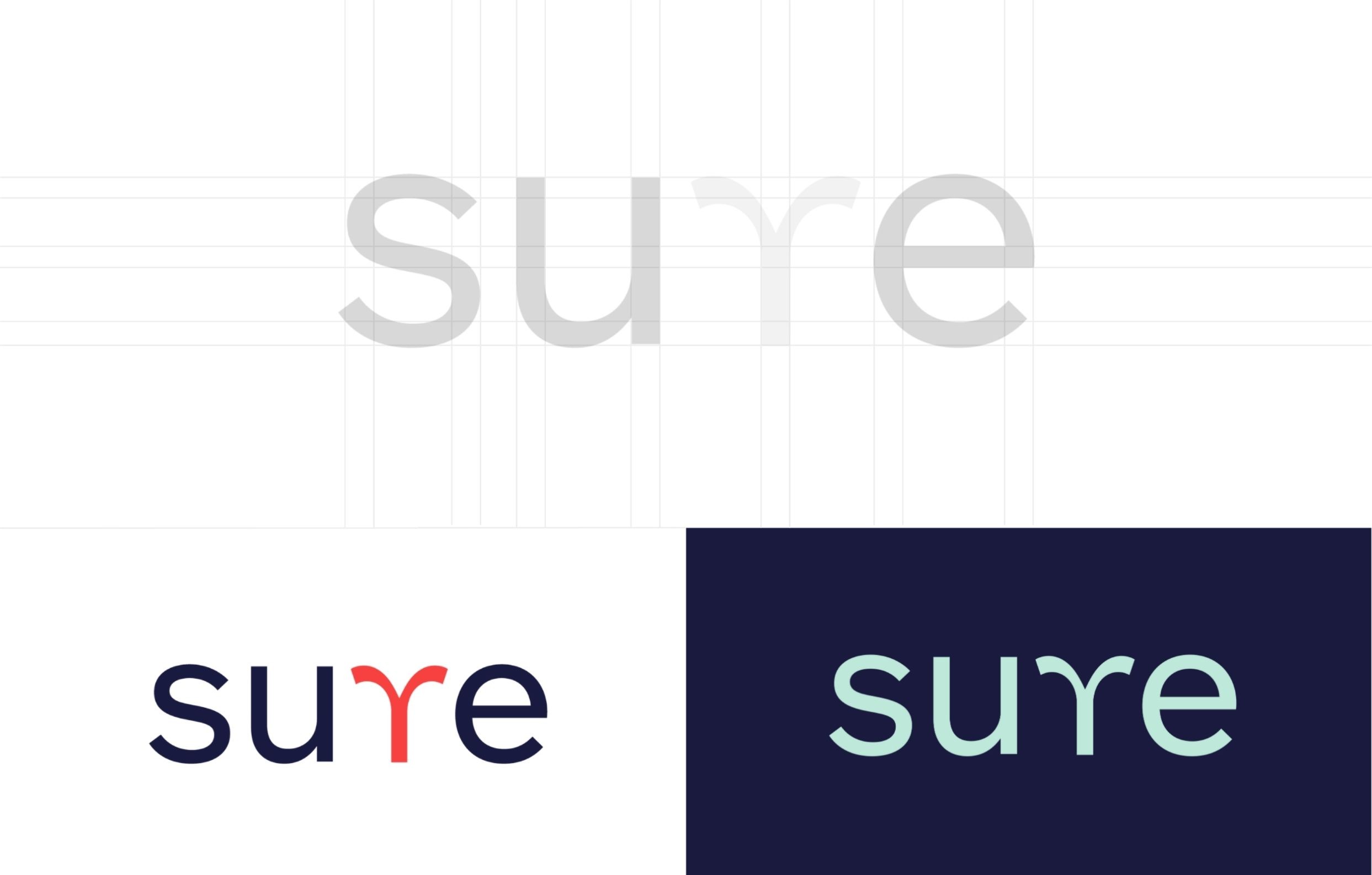
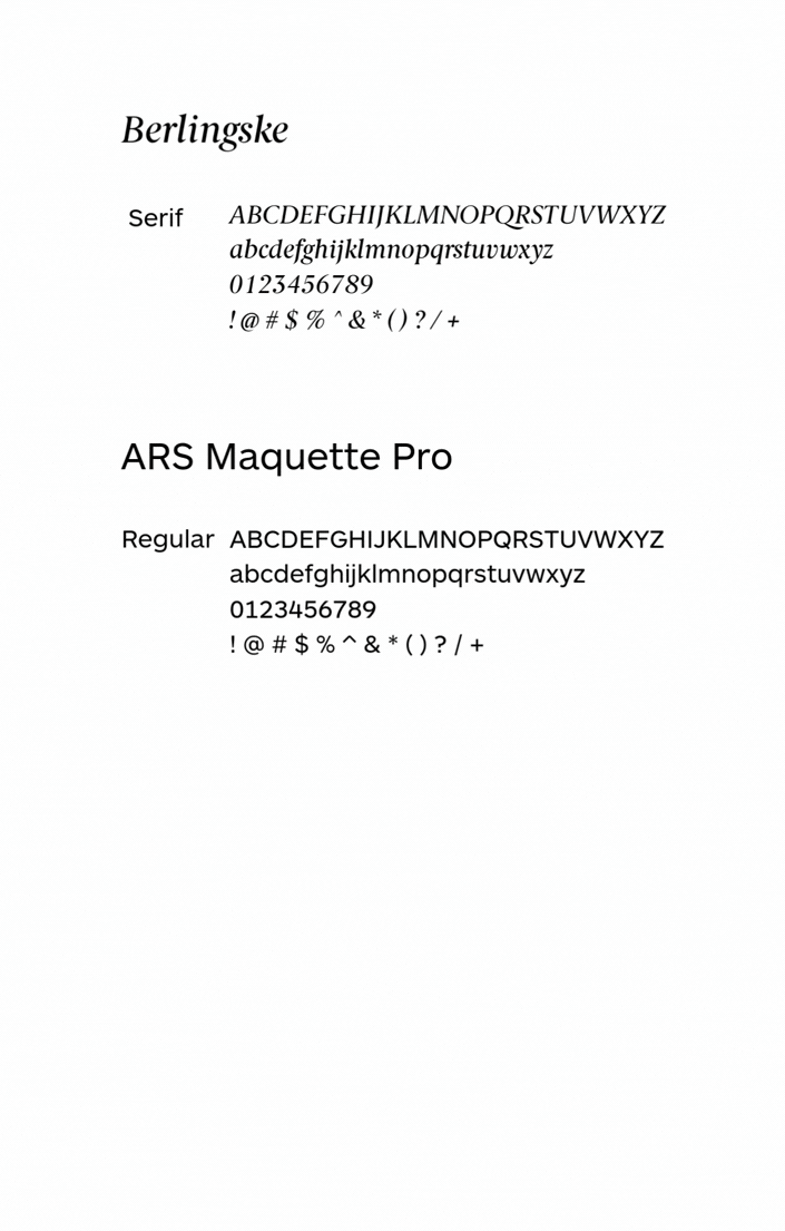
Sure is an insurance brand concept built around the idea of reassurance in moments of uncertainty. When thinking about the identity, I wanted the brand to reflect how people often face different paths and decisions in life—while insurance exists to make those choices feel less stressful.
The logo plays with this idea by reflecting the “r” in the wordmark so it forms a forked path. It’s a subtle visual reference to life’s crossroads, while still keeping the mark simple and memorable. From there, I built the rest of the brand system around clarity and confidence, including the tagline “Be sure to insure.”


Project type
Branding
Client
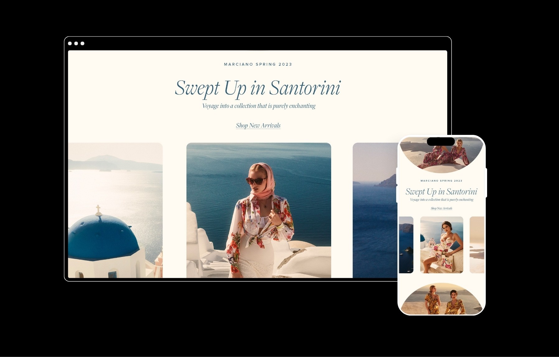
Marciano
Sure: A Brand for Life’s Uncertain Moments
A branding system designed to feel clear, reassuring, and adaptable.
Designer
Jane Chen
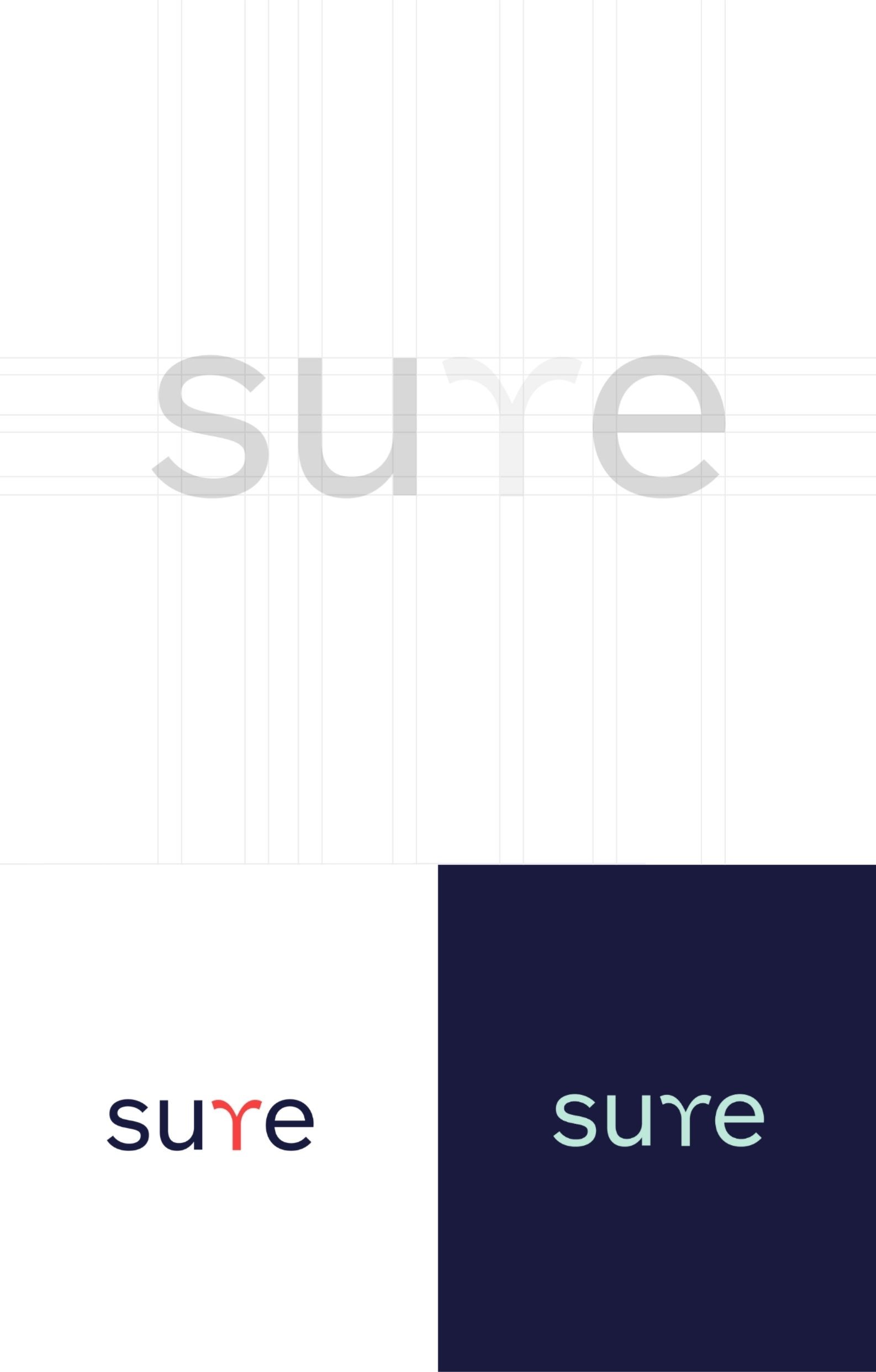
Sure is an insurance brand concept built around the idea of reassurance in moments of uncertainty. When thinking about the identity, I wanted the brand to reflect how people often face different paths and decisions in life—while insurance exists to make those choices feel less stressful.
The logo plays with this idea by reflecting the “r” in the wordmark so it forms a forked path. It’s a subtle visual reference to life’s crossroads, while still keeping the mark simple and memorable. From there, I built the rest of the brand system around clarity and confidence, including the tagline “Be sure to insure.”
Project type
Branding
Client
Marciano
Sure: A Brand for Life’s Uncertain Moments
A branding system designed to feel clear, reassuring, and adaptable.
Designer
Jane Chen
Sure is an insurance brand concept built around the idea of reassurance in moments of uncertainty. When thinking about the identity, I wanted the brand to reflect how people often face different paths and decisions in life—while insurance exists to make those choices feel less stressful.
The logo plays with this idea by reflecting the “r” in the wordmark so it forms a forked path. It’s a subtle visual reference to life’s crossroads, while still keeping the mark simple and memorable. From there, I built the rest of the brand system around clarity and confidence, including the tagline “Be sure to insure.”
2026 ® JANE CHEN